Feedback and You

Hey! With this asset pack getting some attention i think theres enough people to start asking for feedback! Ill keep this one brief and simple and hopefully save yall some time, and thanks in advance if you choose to help! :
Question 1 : What have you enjoyed about the asset pack that you want to see more of?
Question 2: What have you not enjoyed about the asset pack that you want to see fixed or changed?
And... thats it!
P.s:
Enjoying the daily content drops? Want even more free goodies?
If you believe this asset pack deserves ongoing development, cast your vote with a quick rating! In just 10 seconds, you can let others know that this pack is crafted with care and worthy of attention. Your rating helps shine a spotlight on this project, making it possible for me to continue creating great content for you. Thank you in advance for your support! :)
If you arent sure how to rate a project on Itch.io, heres a YT Video showing where you can do that!:
Get Free - Whimsy Hallow Asset Pack - Dungeon
Free - Whimsy Hallow Asset Pack - Dungeon
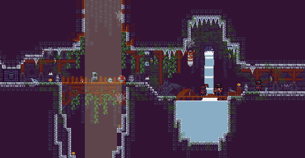
Simple and Shiny 16x16 2D platformer sprites, themed around medieval fantasy.
More posts
- 🥳 Whimsy Hallow Has Reached 1,000 Downloads! 🎉Sep 28, 2024
- 🎉 Whimsy Hallow Asset Pack V1.62 Now Freely Available! 🥳Aug 28, 2024
- Whimsy Hallow Project Update!Aug 27, 2024
- 🎉 Whimsy Hallow Asset Pack V1.61 Now Freely Available! 🥳Aug 25, 2024
- 🎉 Whimsy Hallow Asset Pack V1.60 Now Freely Available! 🥳Aug 24, 2024
- 🎉 Whimsy Hallow Asset Pack V1.59 Now Freely Available! 🥳Aug 23, 2024
- Update!Aug 22, 2024
- 🎉 Whimsy Hallow Asset Pack V1.58 Now Freely Available! 🥳Aug 21, 2024
- 🎉 Whimsy Hallow Asset Pack V1.57 Now Freely Available! 🥳Aug 20, 2024
- 🎉 Whimsy Hallow Asset Pack V1.56 Now Freely Available! 🥳Aug 19, 2024

Comments
Log in with itch.io to leave a comment.
Hi,
I've enjoyed the asset pack, and I would like to see some more decorations and other useful stuff like a door drawn for the side to separate the rooms.
Some tiles like chests are still not aligned to the grid, that makes tile based games unable to use them.
Sure, what kind of decorations were you thinking? I got some in mind but always nice to hear from others.
As for the chests, The way they open plus the fact i wanted to have their position on the spritesheet account for the little "jump" they do when opening has them set the way they are, but if you wanna send a picture over to let me see the problem first hand im sure we can get it sorted.
As for the door, thats actually a good idea! Part of this asset pack is inspired by games like Celeste and Enter The Gungeon which both have those kind of doors your talking about, ill take a look and see how they do it and get my own take ready for the next update; Version 1.26 along with some other goodies. :)
The problem with chests is that their stationary sprite's bottom left corner is not aligned with the grid, so when they are placed on a tile grid, they look odd. The animation can be done if it is relative to the grid, that way it will start and end on the grid.
Also some things like crafting bench, some effects like fog from the caldron, some more ui elements like the dialog window. Maybe even some tiles for more open areas like windows on the background.
I was thinking about some 1 tile wall shelf to place candles on, maybe some cracked tiles, some more variation for the wall tiles to make them look more real.
Also I'm currently using an asset pack for items like this one: https://chunkgen.itch.io/16-bit-rpg-asset-pack, but it would look much better to have it in your style, because it won't stick out of the rest.
Ty for all the feedback, I think all of that except maybe the items i can take a look at getting in this next update, mostly just because thats a bit of a Pandora's box i dont think would be appropritate to open... FOR NOW that is.
Thank you
Also, some icons for game designers would be great, because I usually use icons from the tile set for some markings like the goal, player start location, lights, etc. Now I'm using some icons from your texture pack, but they blend in with the rest. It would be great if you would add some icons for that purpose.
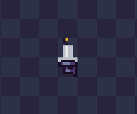
Sure ill see about it! Also by candle shelves, what about a candle holder like this?
Great! Also what about a version hanging from the background?
Like this?